
Griswold’s logo changed across several distinct design eras over the company’s history, and while pinning down an exact year for any specific variation is genuinely detailed collector-level work, understanding the broad eras and what a genuine cast-in mark actually looks like is essential before spending real money on a piece.
Early Marks
Griswold’s earliest identifiable marks generally spelled out “Erie” along with the company name in a straightforward block or early script style, reflecting the company’s Erie, Pennsylvania origins well before the more elaborate logos of later decades.
The Slant Logo Era
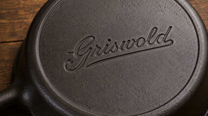
A distinctive slanted script logo is one of the more recognized mid-period Griswold marks among collectors, often considered among the more desirable eras to find on a well-preserved piece, though desirability within the hobby shifts somewhat with collector trends over time.
The Large Block Logo Era
Later Griswold production shifted to a bolder, large block-letter logo, commonly paired with “ERIE, PA. U.S.A.” spelled out beneath it, representing the company’s later, higher-volume production years before the original Erie foundry stopped operating.
Why Cross-Referencing Precise Eras Matters
Because exact year ranges for each logo variation are genuinely detailed and still actively documented and debated among specialist collectors, cross-referencing a specific mark against a dedicated Griswold reference guide or collector club resource gives far more precise dating than any general overview can responsibly provide.
What a Genuine Cast-In Mark Looks Like
A genuine Griswold mark was cast directly into the piece as part of the original mold, which means the lettering shows smooth, consistent depth and integrates naturally with the surrounding surface texture — there’s no seam, tool mark, or texture mismatch between the lettering and the rest of the casting, since both came from the same mold at the same time.
How Fake Marks Usually Differ
A mark added after casting — whether acid-etched, engraved, or otherwise applied to an unmarked or different pan — typically shows some combination of inconsistent depth, visible tool marks, a texture that doesn’t quite match the surrounding casting, or lettering that’s subtly the wrong font, spacing, or proportion compared to a genuine period mark; see our fakes and reproductions guide for a fuller breakdown of these tells.
Marks Alone Aren’t Enough
A convincing mark is necessary but not sufficient for confident authentication — cross-checking the mark against the piece’s size number, pattern number, overall weight, and casting quality gives a far more reliable picture than any single check alone; see our skillet numbers guide for how that cross-referencing works in practice.
Documenting What You Find
Photographing a mark clearly, straight-on and in good light, creates a record worth keeping and worth sharing with a collector community or specialist if a second opinion is ever needed — a habit worth building from your very first piece rather than only once a collection starts to feel serious.
Stickers and Paper Labels
Beyond the cast-in mark, Griswold pieces sometimes carried paper labels or stickers at the point of original sale, which almost never survive decades of kitchen use and washing — a piece missing any such label isn’t unusual or suspicious, it’s simply the normal outcome of a label that was never meant to be permanent.
Why This Mark History Rewards Patience
Unlike some makers where marks are inconsistent or barely documented at all, Griswold’s relatively well-mapped logo eras give collectors a genuinely useful reference point, even though the fine-grained year-by-year detail still rewards deeper, specialist study once the broad eras feel familiar.
A Practical Dating Workflow
- Identify the general logo style: early spelled-out Erie, slant script, or large block lettering
- Check for smooth, integrated casting depth with no visible tool marks
- Cross-reference against the size and pattern numbers present on the same piece
- Compare against a dedicated Griswold mark reference for the specific variation you’re seeing
Photographing Marks for Comparison
A clear, well-lit, straight-on photo of a mark — taken with a ruler or coin included for scale — is far more useful for comparison against reference photos or for sharing with a collector community than a quick, angled snapshot, especially when the fine detail of lettering depth is exactly what’s being evaluated.
This small extra effort pays off enormously if a second opinion is ever needed later.